EasyWP by Namecheap Inc. is a managed WordPress hosting product designed to make the web and technology accessible to everyone, reducing complexity, stress, and technical friction for creators, makers, and small businesses.
As the product ecosystem evolved, the brand needed to mature alongside it, without losing the recognisability and emotional connection users already had with the octopus icon.

The challenge wasn’t to reinvent EasyWP, but to evolve it responsibly.
While the octopus was a strong and recognisable symbol, the surrounding visual language lacked a clear system.
Typography, colour usage, illustration, motion, and photography needed alignment across product and marketing touchpoints.
The risk wasn’t changing too little, it was changing too much and losing brand equity.

Before

After
Before

After
The work began at a strategic level.
Using a brand strategy framework focused on context, company, category, and consumers, the goal was to define what EasyWP should stand for, how it should behave, and how it should scale over time.
Key principles emerged:
Simplicity over decoration
Trust and transparency over technical intimidation
A human, approachable tone grounded in real people and real use cases
A system that empowers teams to move fast without fragmenting the brand
The brand archetype blended Creator, Caregiver, and Idealist, reinforcing EasyWP’s role as a product that demystifies complexity and enables people to build with confidence.


Brand strategy
The octopus remained the core brand icon.
Rather than redesigning it, the focus was on how it lived within the system:
Clarifying its role as a recognisable anchor
Defining consistent usage across touchpoints
Allowing it to coexist with new visual elements without overpowering them
This ensured continuity for existing users, while giving the brand room to grow.
A modular, scalable design system was developed to support consistency across product, marketing, and communication.
The system included:
Visual foundations
A refined colour palette anchored in Green Coral, supported by secondary accents and governed by clear colour-ratio rules to avoid visual noise
A clear typographic hierarchy designed for readability, accessibility, and digital environments
A restrained approach to texture and background shapes to add warmth without distraction
Illustration & iconography
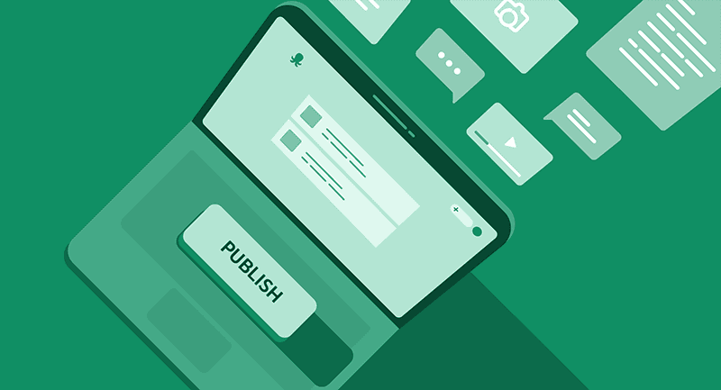
A unified illustration language built from simple geometric forms and organic shapes
Characters, objects, and abstract elements designed to work together within a consistent visual logic
Iconography designed for clarity and friendliness, reinforcing ease of use
Photography & motion
Lifestyle-driven photography focused on real people, real moments, and natural light
Motion principles that felt smooth, approachable, and supportive, never overwhelming
Together, these elements created a system that was recognisably EasyWP, but far more coherent, flexible, and future-proof.

Brand Design System

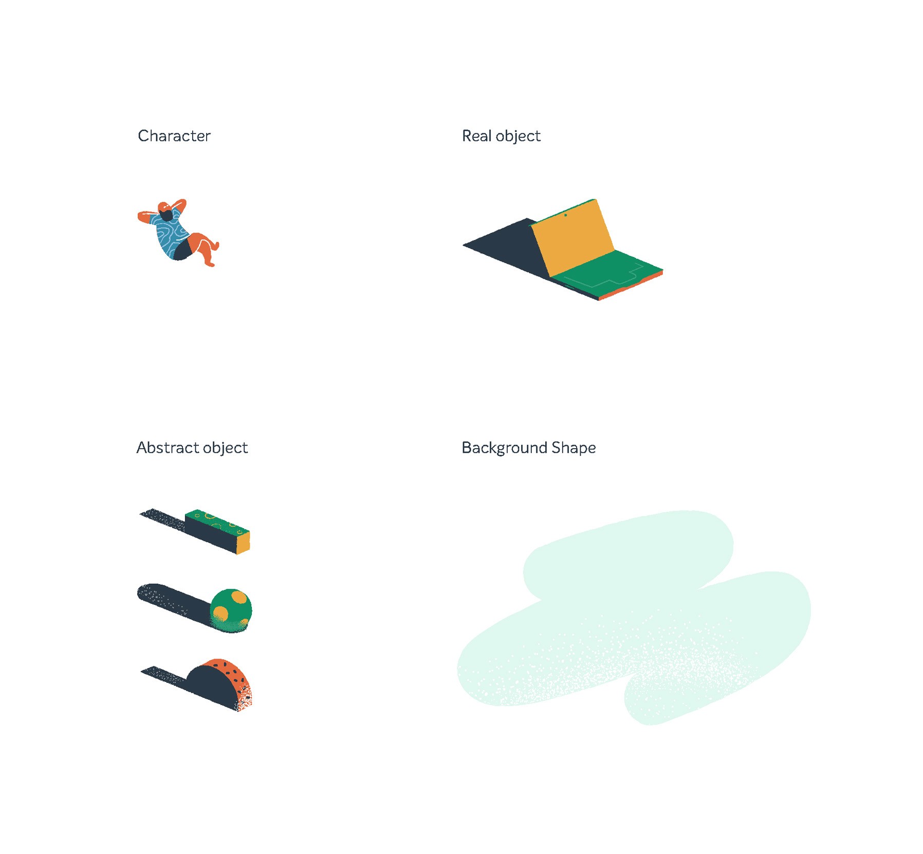

Illustration System - Brand Design System

Illustration System - Brand Design System
The result was a confident, cohesive brand system that respected EasyWP’s existing identity while enabling it to scale across products, platforms, and audiences.
Teams gained a clear framework to design, communicate, and evolve the brand consistently, without sacrificing the simplicity and warmth that define EasyWP.


Blogposts illustartions


Motion examples


Social media example
Brand strategy, brand system design, and creative direction.
